Extending Type Through Motion
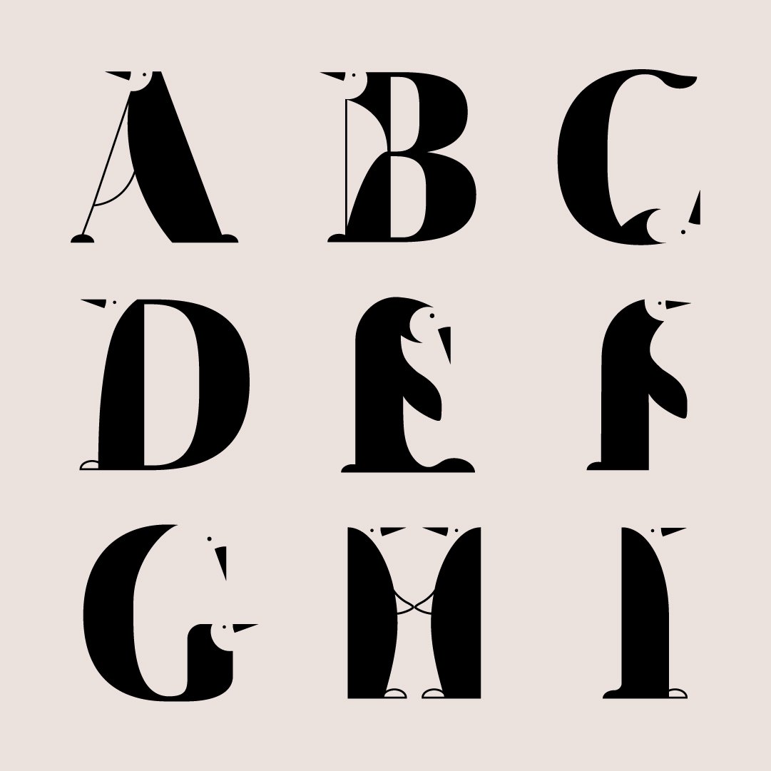
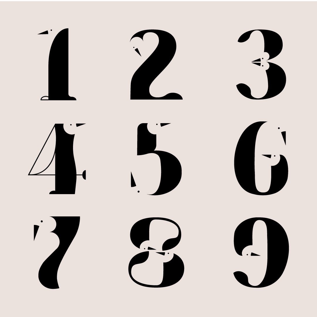
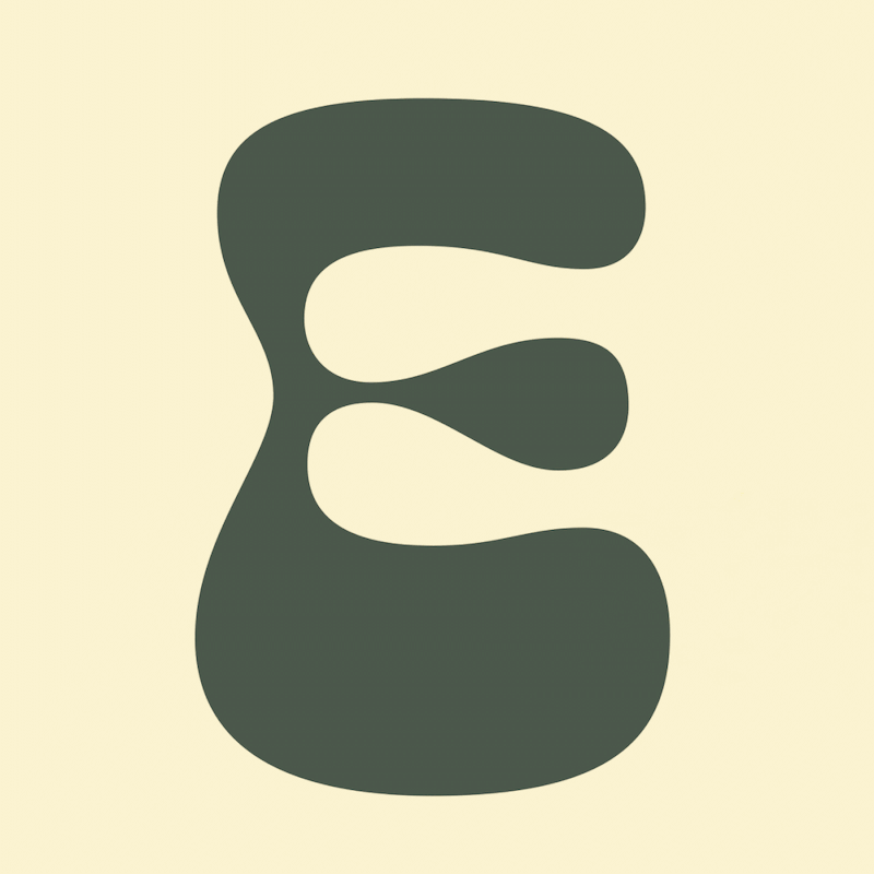
36 Days of Type began as a personal challenge to push my creative limits through constraint, repetition, and exploration. Rather than treating each letter as a standalone piece, I used the project as a system-led exercise — focusing on negative space and form to develop a cohesive typeface built entirely through shape and absence.
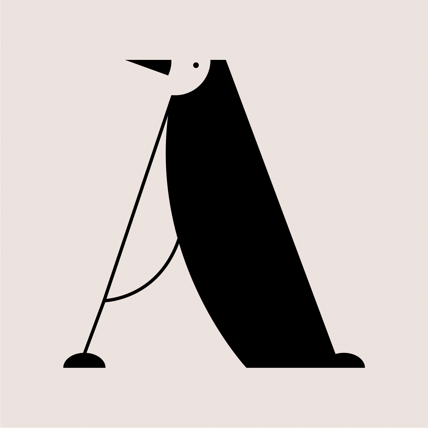
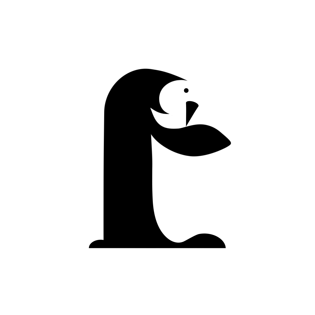
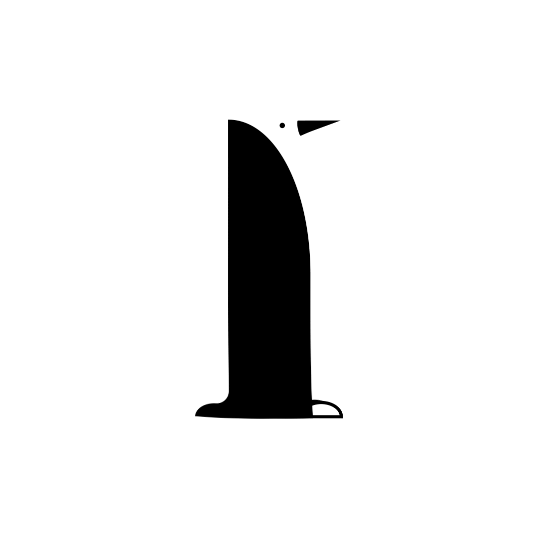
The series became an ode to endangered penguin species, using negative space to construct each glyph and bring an underlying narrative into the work. Sketching was completed in Adobe Fresco, with the final type designed and refined in Adobe Illustrator. What started as an upskilling exercise quickly evolved into a playful, repeatable process that invited experimentation and iteration.
As the project grew, it naturally extended into education and sharing. I brought the process into my livestreams, using the work as a way to talk through decision-making, constraints, and creative systems in real time. The typeface was later animated in collaboration with Evan Abrams, who explored motion versions of select glyphs live on Behance — extending the project beyond static design and into movement.


Each day became a focused exercise: testing how type behaves once it leaves the static frame, building familiarity with motion tools, and working through ideas quickly without over-polishing.
Working within the same framework across different moments in time created space for different questions to surface — about motion, structure, restraint, and iteration.


This approach carries into client work through system-led thinking, comfort with experimentation, and processes that allow ideas to evolve through use rather than being fixed upfront.
