Rebrand for Soban Cafe
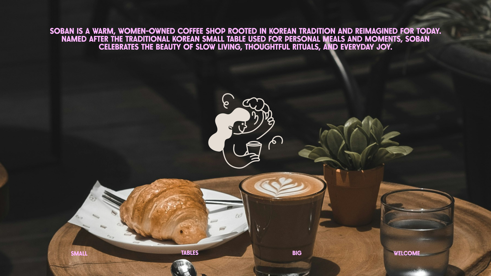
Soban: Small Tables, Big Welcome
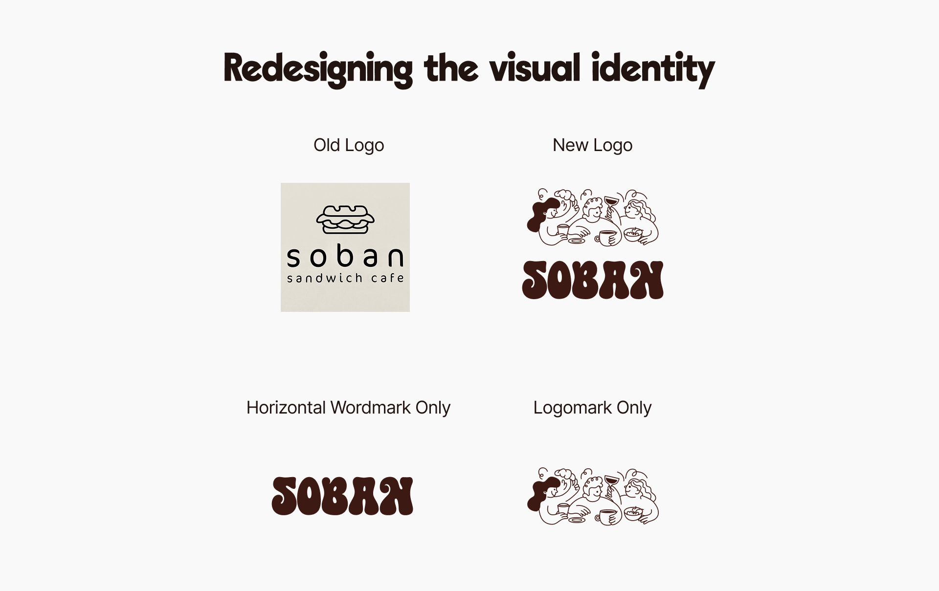
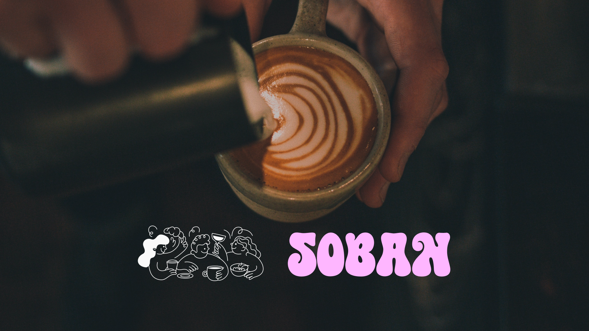
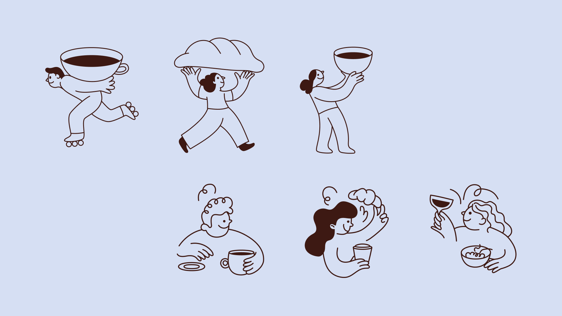
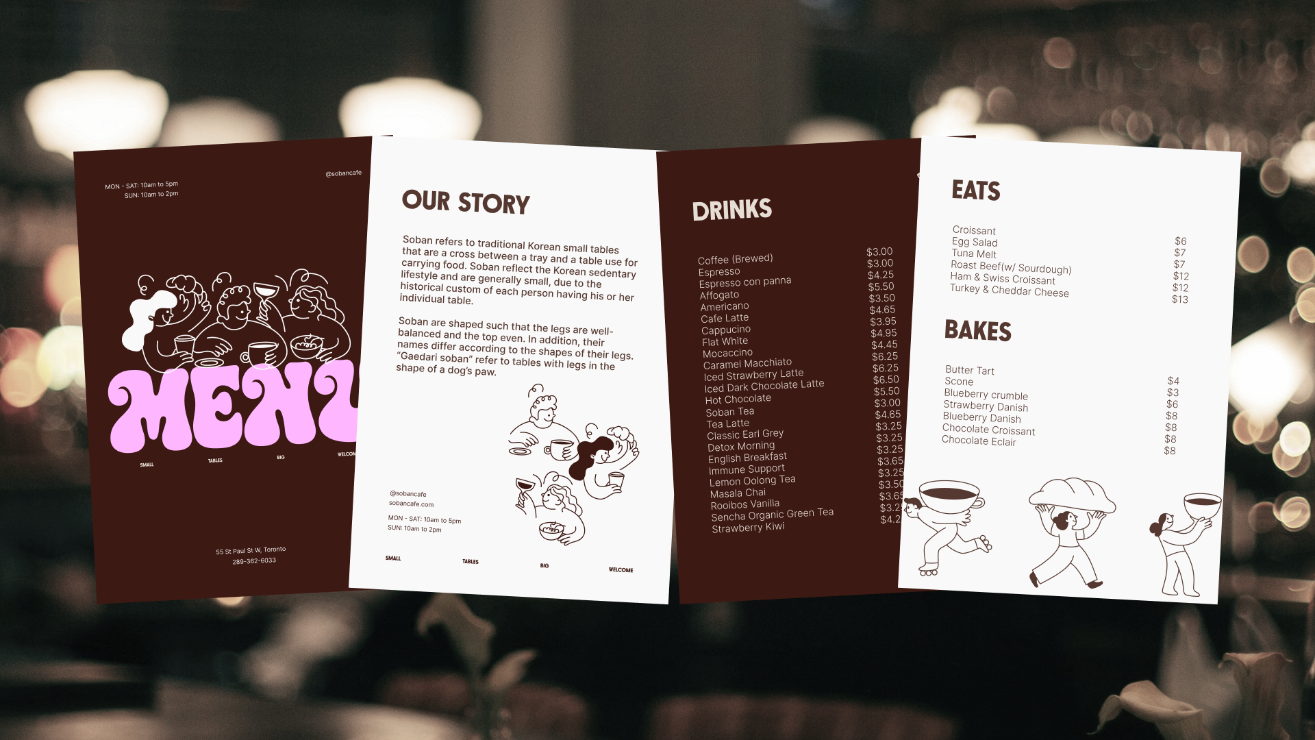
Soban is a warm, women-owned coffee shop rooted in Korean tradition and reimagined for today. Named after the traditional Korean small table used for personal meals and moments, Soban celebrates the beauty of slow living, thoughtful rituals, and everyday joy. The tagline, “Small tables, big welcome”, sums up the heart of Soban — a place where you’re always invited to sit down, slow down, and feel at home.
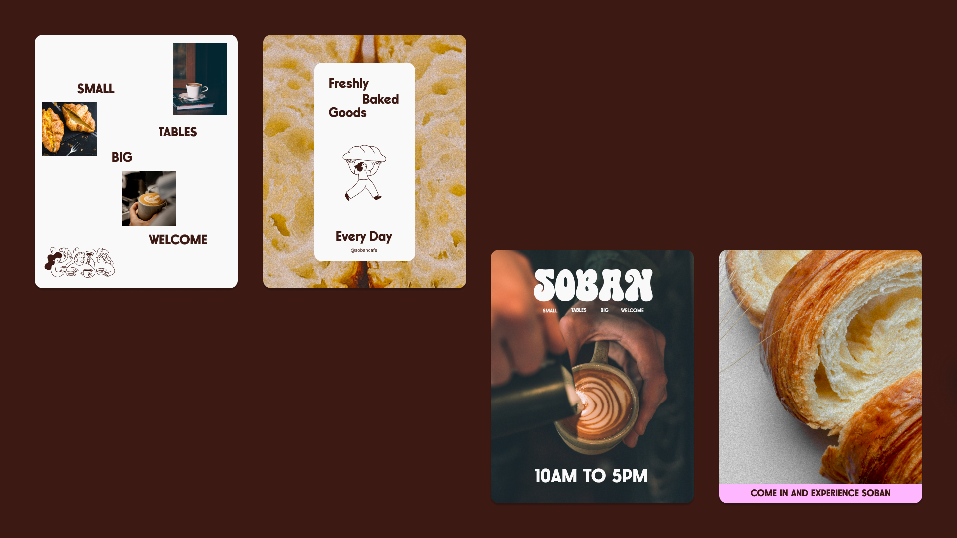
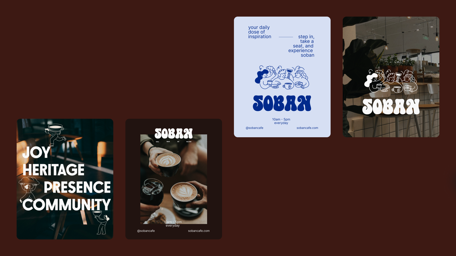
The brand strategy shaped Soban into more than just a coffee shop. It positioned the café as a space for genuine connection, focusing on thoughtful details, from the way the food is made to the way stories are shared. By using playful words, a cozy visual style, and a clear voice, the rebrand helped Soban stand out and feel familiar at the same time — turning each visit into something worth remembering.
Project Scope
– Brand Discovery & Strategy
– Logo & Identity System
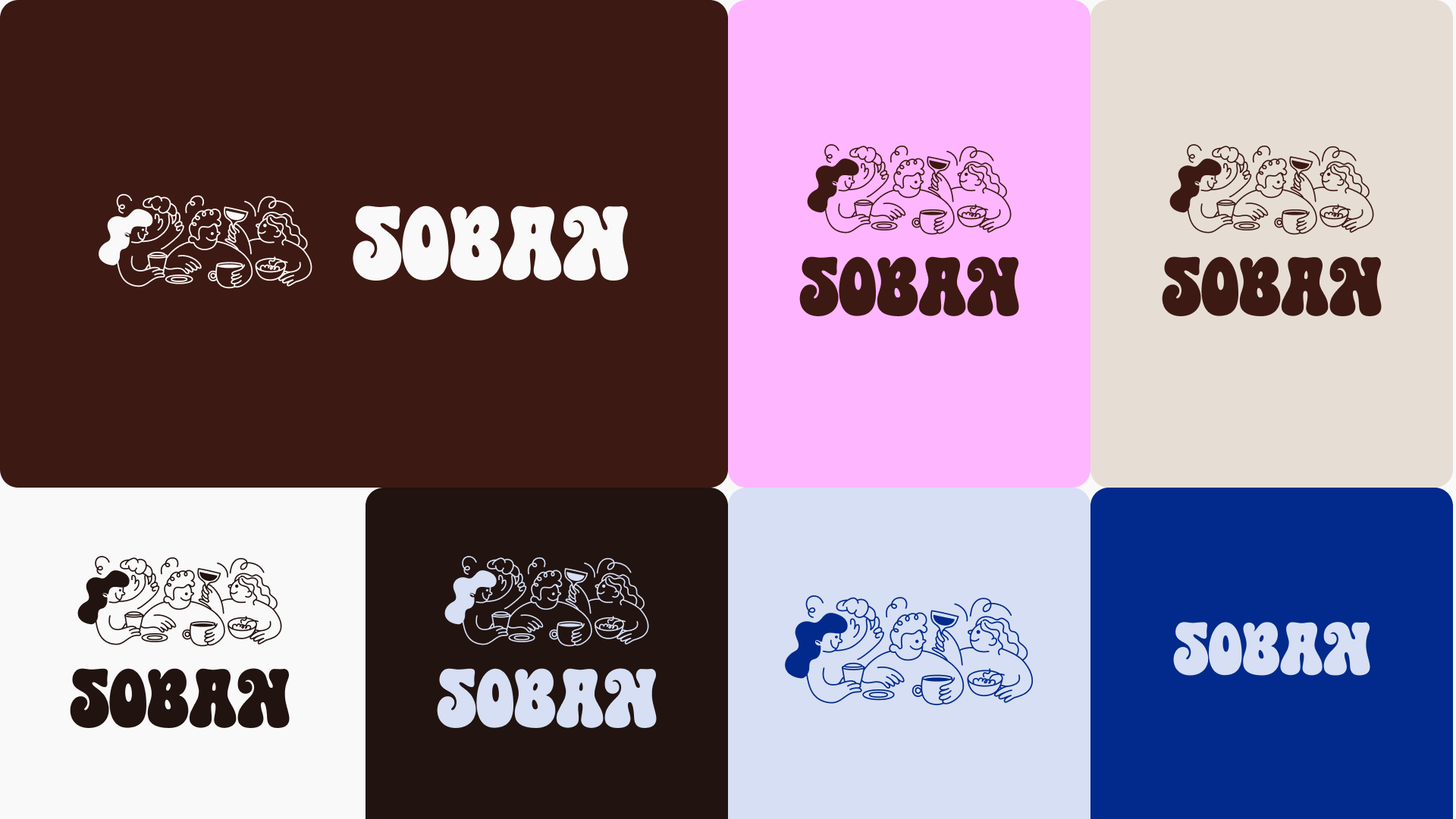
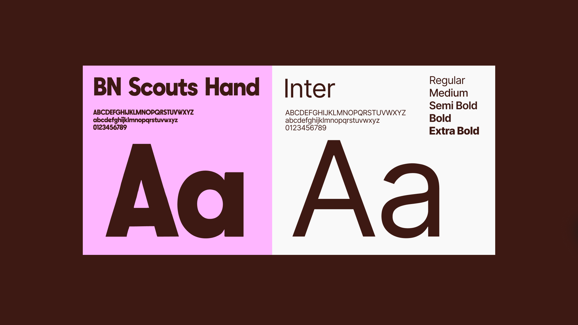
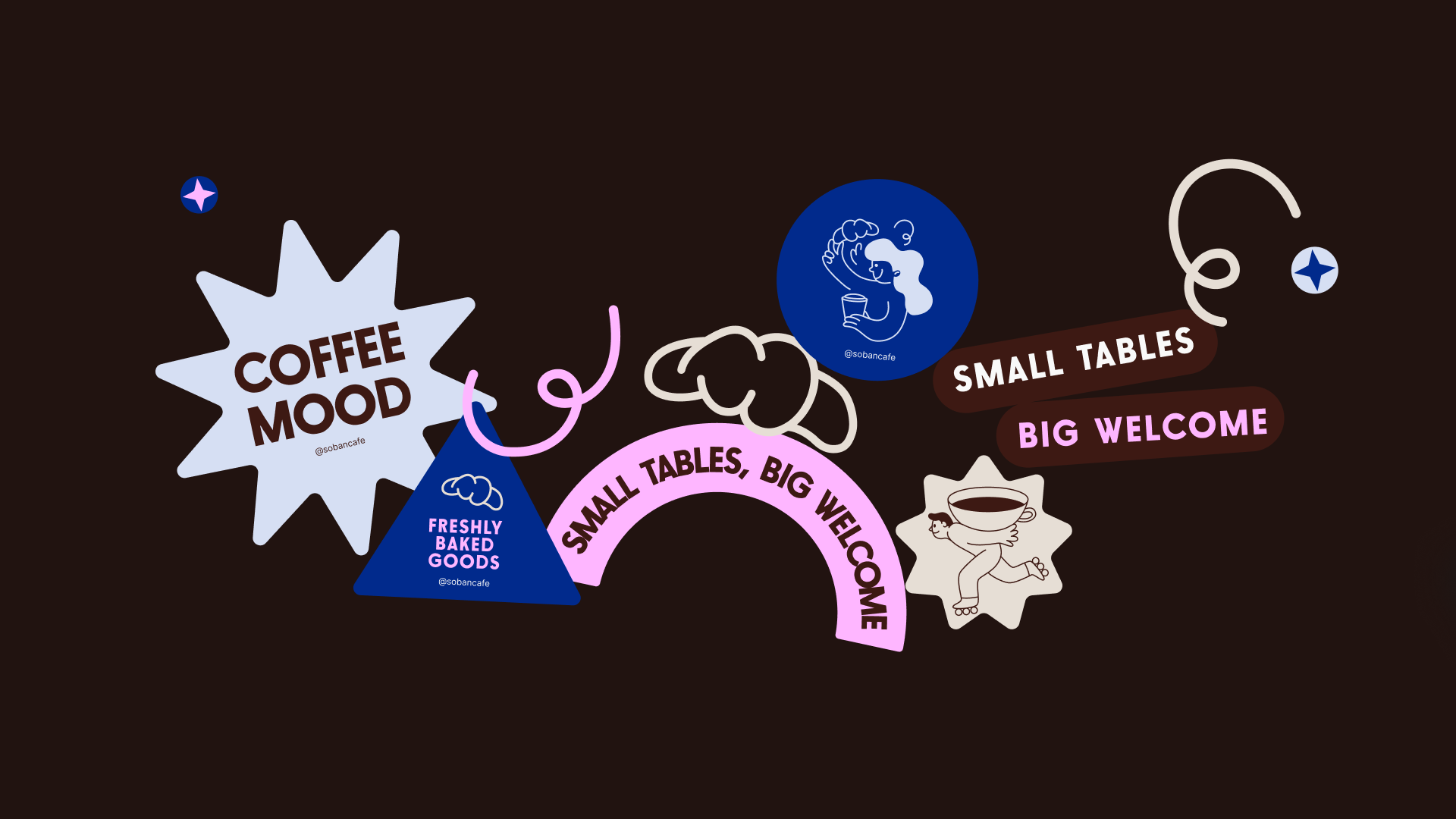
– Typography & Color
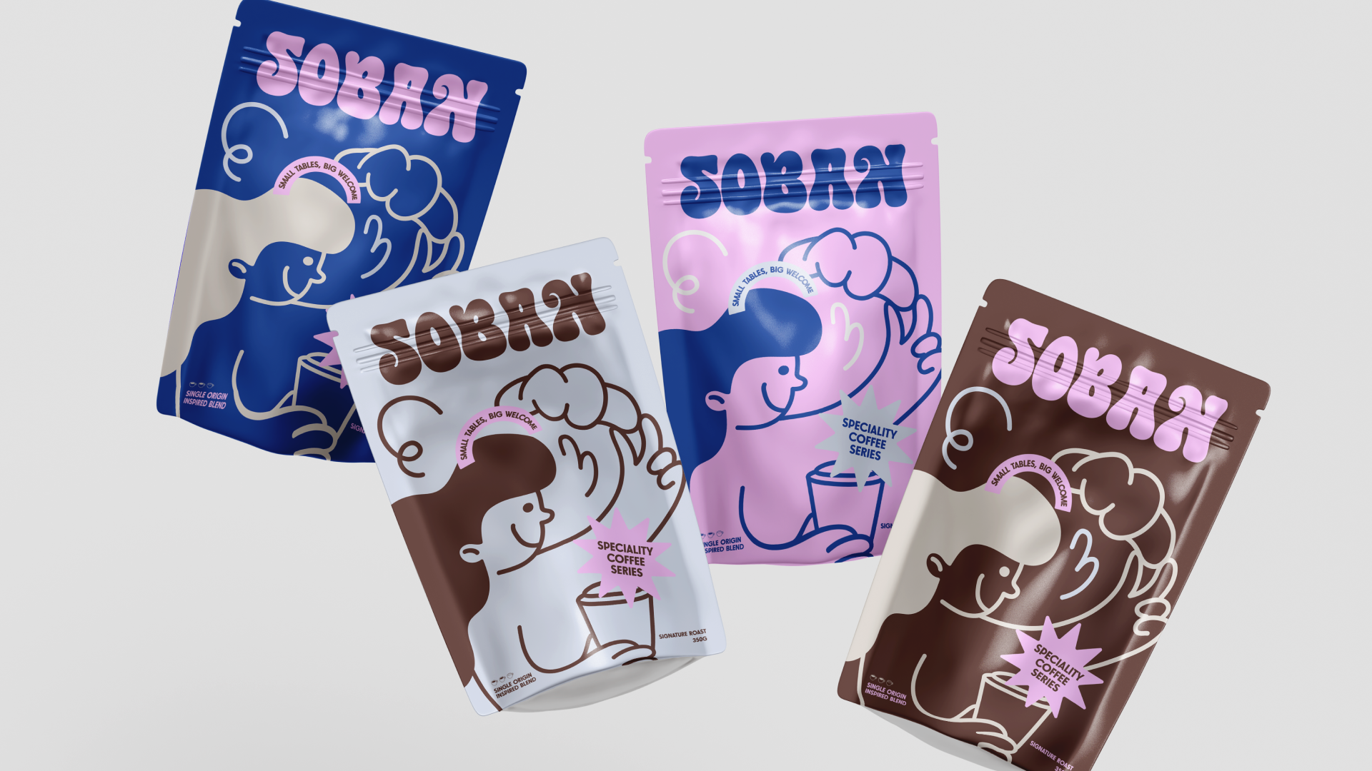
– Packaging & Brand Language
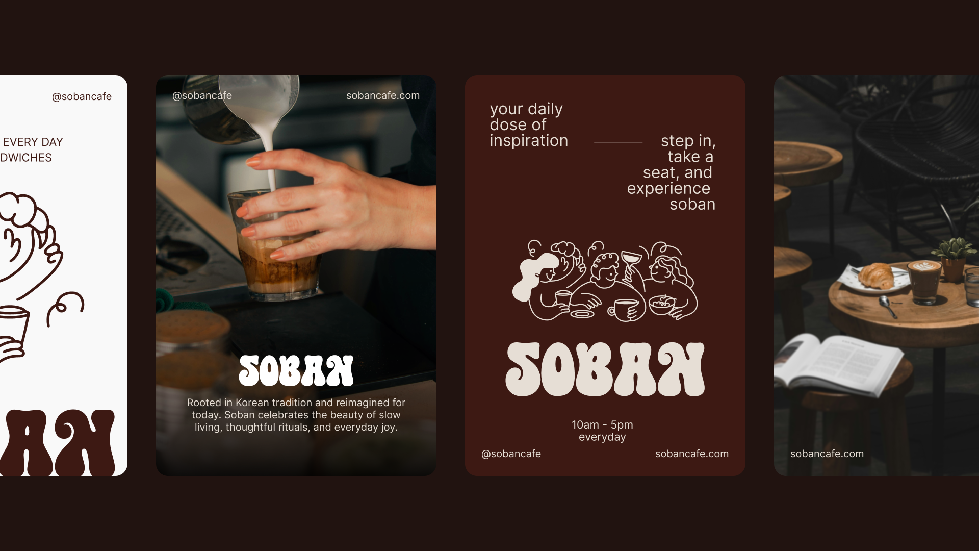
– Social Media Templates